
|
In celebration of the release of my new grayscale coloring book, Beautiful Nature, I thought it would be fun to do an "eye-candy" post. Grab a cup of tea, sit back and enjoy watching this collection of animated GIFs from Beautiful Nature. Watch as three incredible colorists transform over 40 grayscale images to fully colored works of art!
The collection of GIFs is included in the following video but I have also included them individually in the post below. That way you can watch your favorites over and over again as well as find out which colorist colored which picture and the mediums they used. Video of the Collection of Animated GIFs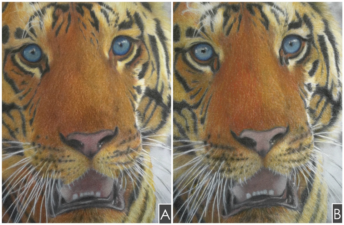 Which was colored with which? Prismacolor Premiers vs. Faber Castell Polychromos Tiger from the Beautiful Creatures grayscale coloring book For a long time I've heard many wonderful things from the coloring community about both Prismacolor Premier colored pencils and Faber Castell Polychromos colored pencils. I've had some Prismacolor Premiers for a while (which I love!) and recently was fortunate enough to also get a set of Faber Castell Polychromos pencils (which I also love!). Once I had both, I decided it was time to conduct a head to head test!!
In this post I will:
I recently discovered how wonderful coloring grayscale with colored pencils over water-based markers can be! I suspect it would be even better over alcohol-based markers but that is something I haven't tested yet and will have to wait for a future post :-). The marker serves as a great base of color that can add some richness and depth to your image. If the marker color is light enough then the grayscale details will show through making it easy to figure out where and how dark or light to go with the colored pencils. 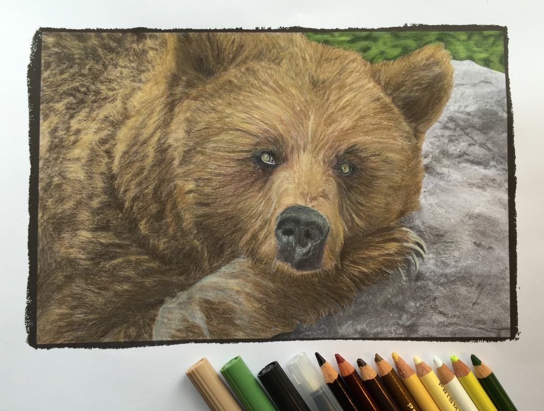 I completed the bear above using this technique. The bear has a ton of fur detail that would have taken me hours to do with just colored pencils. By coloring the entire bear (except the eyes & nose) and the background with Tombow Dual Brush Pens I was able to get a base of color and then just focus on enhancing the detail with colored pencil. I found that I did not need to be too precise with the colored pencils. Overall, it made the process faster but still really enjoyable and I achieved a more vibrant result thanks to the color coverage from the markers.
In this post I'm going to walk you through my step-by-step process of coloring two different pictures using this technique and what my key learnings were. One I colored with Staedtler Triplus Fineliners and the other with Tombow Dual Brush Pens as well as Fineliners for the smaller areas. In both cases I used Prismacolor Premier colored pencils over top. 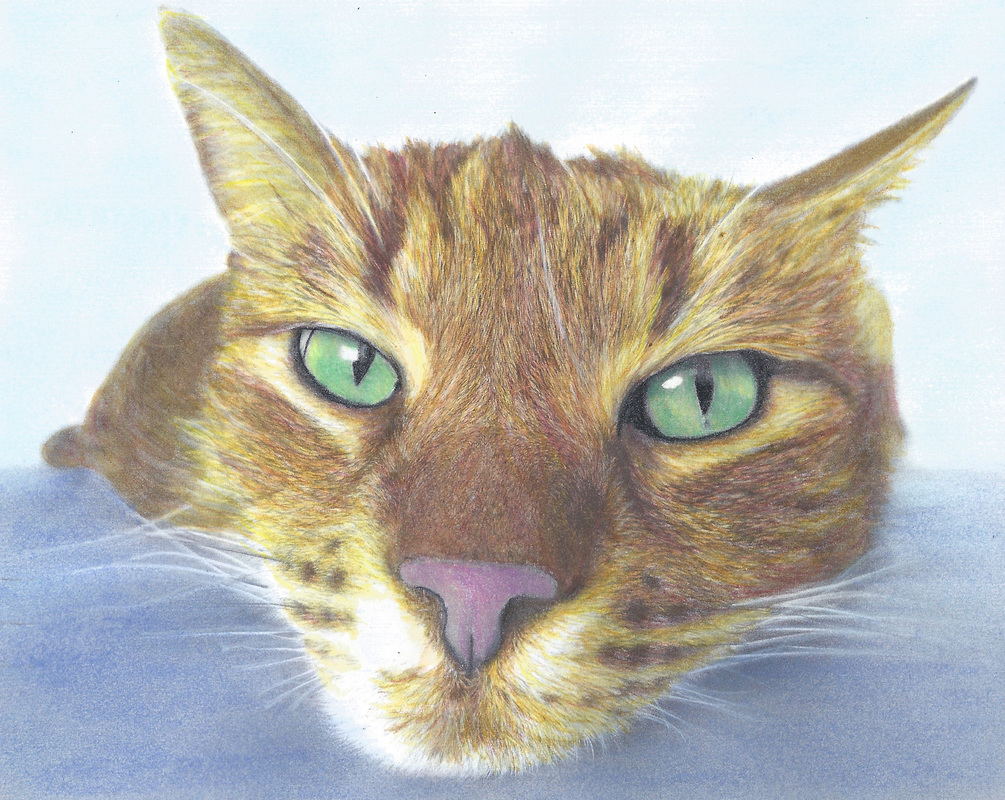 Coloring Book: Beautiful Creatures Colorist: Nicole Stocker When coloring over grayscale you are using the gray as your guide. Where there are dark grays you use dark colors, where there are light grays you use your light colors. Then seamlessly blend your lights and darks together with medium colors. Derwent Inktense pencils work nicely for this style of coloring (provided the paper can handle it) because you can apply your color and then blend it all so nicely together when you activate the pencils with your watercolor brush. Specific techniques used in the following time-lapse video:
Mediums used in the following time-lapse video:
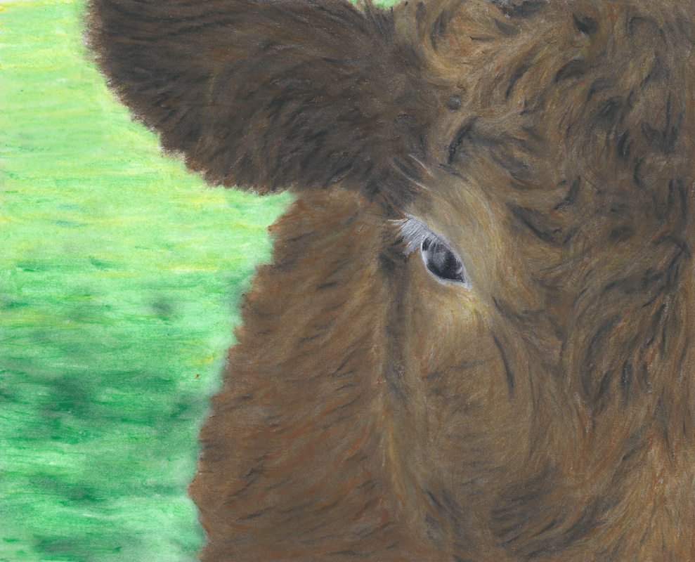 Coloring Book: Beautiful Creatures Colorist: Nicole Stocker Here I tried coloring over the grayscale cow with oil pastels and then blended them with baby oil. The key thing I learned was that you don't have to be too precise with the pastels because you'll be filling in the spaces when you blend with the baby oil. What is important is that you capture the highlights with your light pastels and the shadows with your dark pastels, then use a medium color pastel to fill in. Specific techniques shown in the following time-lapse video:
Mediums used in the following time-lapse video:
If your approach to grayscale coloring is anything like mine, you probably spend a bunch of time and effort on the main part of your picture and then you are left thinking "what am I going to do for the background??" You are probably also thinking: "I worked so hard on this picture, I don't want to mess it up by doing a bad job on the background!" Well, when you feel this way soft chalk pastels are there for you :-).
With grayscale you can take advantage of the lovely details already present in the grayscale image and just dust over the background with some light color from the soft chalk pastels because those details will come through and give your background some interest. Here are the basic steps which you will see in the following video:
Medium used in the following video:
|