|
Below you will find a wonderful collection of truly useful grayscale coloring tips. All of these tips can apply to line art coloring as well but the visual examples use grayscale coloring pages.
These tips come from the talented artist, Jones Flores. She has very kindly shared her coloring tips with many colorists over the past several months via the Facebook coloring groups. When I asked her if I could gather them all together into one blog post to share with all of you, she very generously sent all her tips my way! In some cases, I have enhanced the tips with additional information that I think you will find helpful. The tips you will find below are:
TIP 1: Making Your Subject Stand Out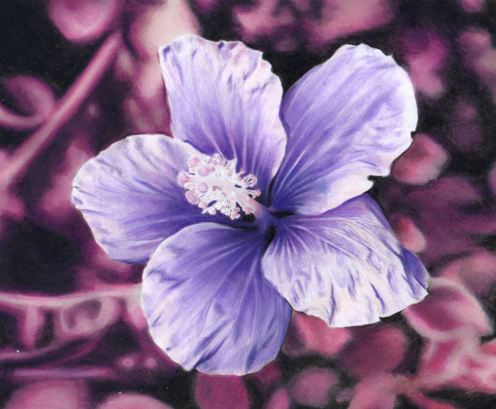
Colorist: Jones Flores
Coloring Book: Beautiful Nature Medium Used: Prismacolor Premier colored pencils
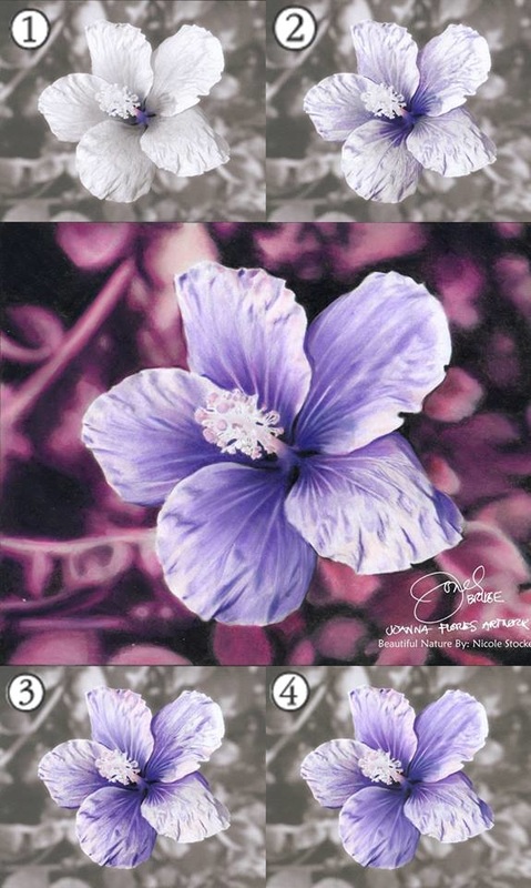
To make your subject jump out of the picture, ensure there is nice contrast between light and dark where your main subject meets your background. In the case of the hibiscus above, Jones was sure to enhance the lightness at the edge of the petals so they stood out against the darker background. As you can see, the hibiscus looks like it's coming out of the picture!
For the hibiscus flower, Jones built up the dark shades of the petals first. Then she used white pencils on the lightest parts and petal edges. When coloring the edges she burnished (heavy pressure) with white pencil to give it a velvety texture. See the collage below of progressive shots for your reference. The final touch was a blurred and dark background. Jones stripped out the busy details of the background by using different shades of one color that fade into the black. She chose pink because it compliments the color of the flower rather than competing with it. This, combined with those white edges, made her beautiful hibiscus really stand out! Tip 2: Coloring Water Droplets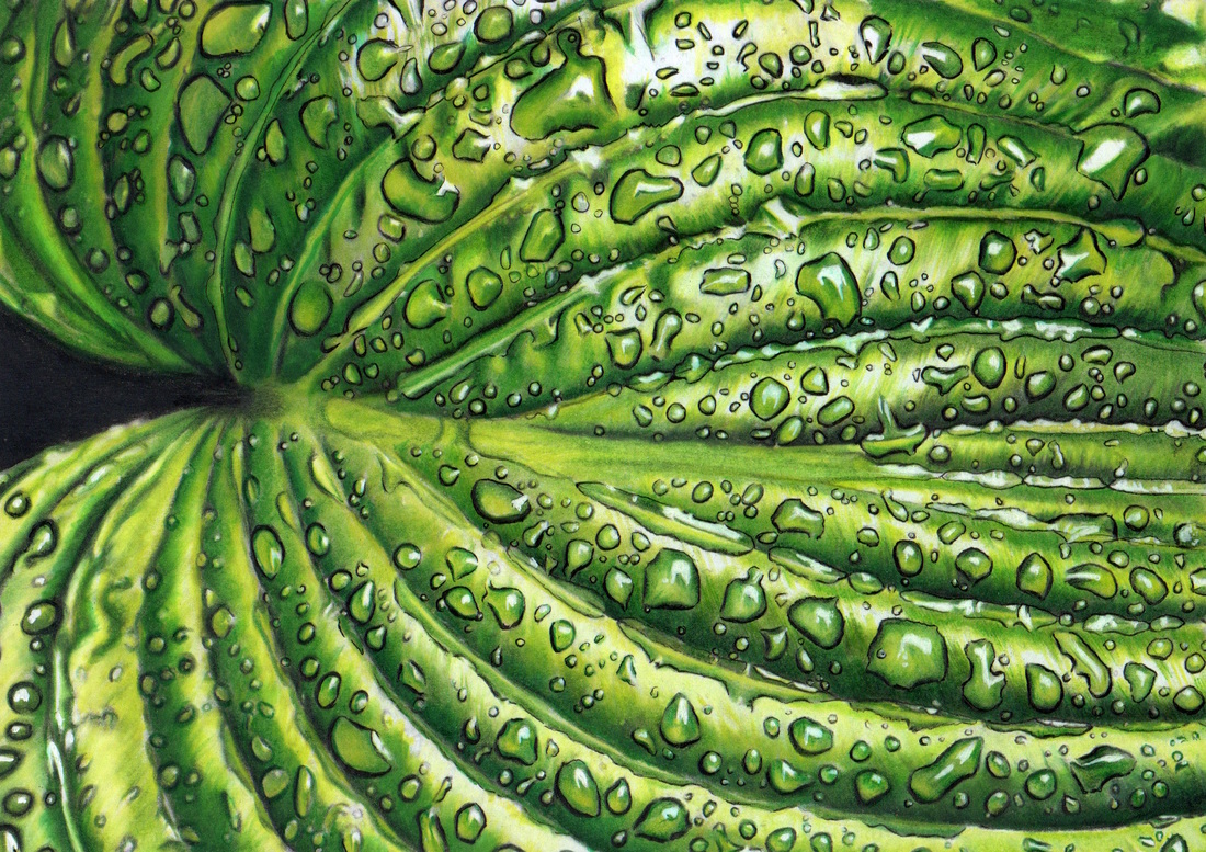
Colorist: Jones Flores
Coloring Book: Beautiful Nature Mediums Used: Prismacolor Premier colored pencils (burnished), Pilot G-Tech 0.3 Black Pen, Fiber Castell Fibre Tip Coloring Pens blended by paint brush and Rotring Isograph White Pen
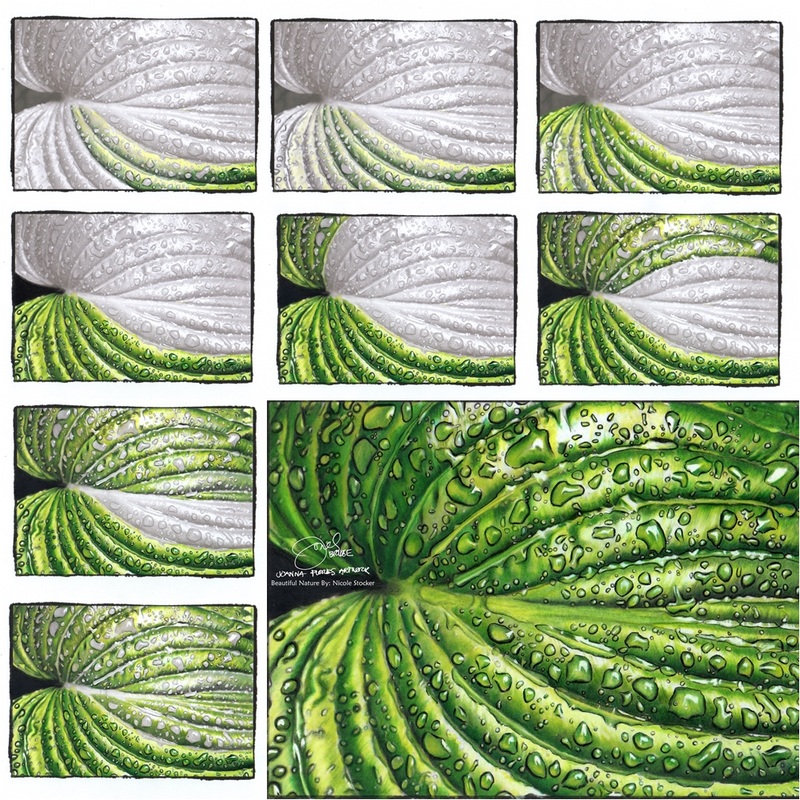
Outline each water droplet with a thin black line (or other dark color) and highlight the light area of the droplet with white. Then, follow the grayscale for determining the lightness or darkness of color to use for the rest of the droplet, choosing colors from the same color palette used for the rest of the leaf. You'll notice that the drops often have some shading near the edges of the drop, this extra shading helps with the 3D effect.
Remember, the contrast of the darkest and the lightest colors are what bring out that nice 3D effect on the water droplets. TIP 3: The One Color Technique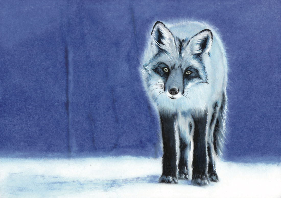
Colorist: Jones Flores
Coloring Book: Beautiful Creatures Mediums Used: Prismacolor Premier colored pencils, Dong-A Ink Pens, White Pigment Pen, Black Permanent Marker and for the background, Soft Pastel mixed with baby oil.
The one color technique is about using different shades of one color (as well as black and white) for the entire picture. You'll find it provides quite a beautiful result and it simplifies your color choices.
It doesn't matter how many sets of colors you have, the important thing is how you build up the values of your light to dark shades. For both the image above and below, Jones used blue because it's her favorite color! Always plan out your colors before getting started. For the FOX, Jones mainly used the following Prismacolor Premier pencils: Ultramarine, True Blue and Light Aqua. Her grayscale coloring process for the fox was as follows:
The secret is BLENDING! Also, be sure to emphasize where the shadows should be (follow the gray for this) because the darkest and lightest lines will define the details. 
Colorist: Jones Flores
Coloring Book: Beautiful Creatures Mediums Used: Prismacolor pencils, Berkeley Turpentine applied with paint brush, white pigment marker and soft pastels
For this TIGER, Jones used the following Prismacolor Premier colors: Light Cerulean Blue, True Blue, Ultramarine, Indigo Blue and mixed with a little white and black.
TIP 4: Using Ink or Gel Pens Over Colored Pencils for Details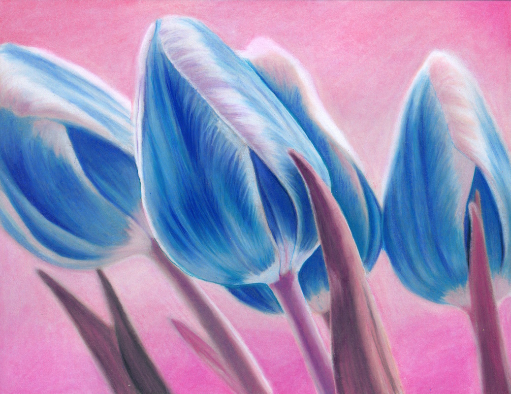
Colorist: Jones Flores
Coloring Book: Beautiful Nature Mediums Used: Soft Pastels mixed with Hair Coat Oil (like Argan Oil) for the background, Primacolor Premier colored pencils, Dong-A Ink Pens blended by paintbrush
After burnishing it is difficult to add more layers of colored pencils. Burnishing is when you apply your pencils hard and push the colors onto the paper. However, with wax-based colored pencils like Prismacolor Premiers (this may also work with oil-based pencils, just haven't tested that yet!) you can use ink or gel pens to add colors & details on top.
When you apply ink or gel pen on top of colored pencil the ink will not dry that fast unlike when you apply it to fresh paper. Since it doesn't dry very fast you have the opportunity to smudge it with your finger or blend it with a paintbrush. Examples of this technique:
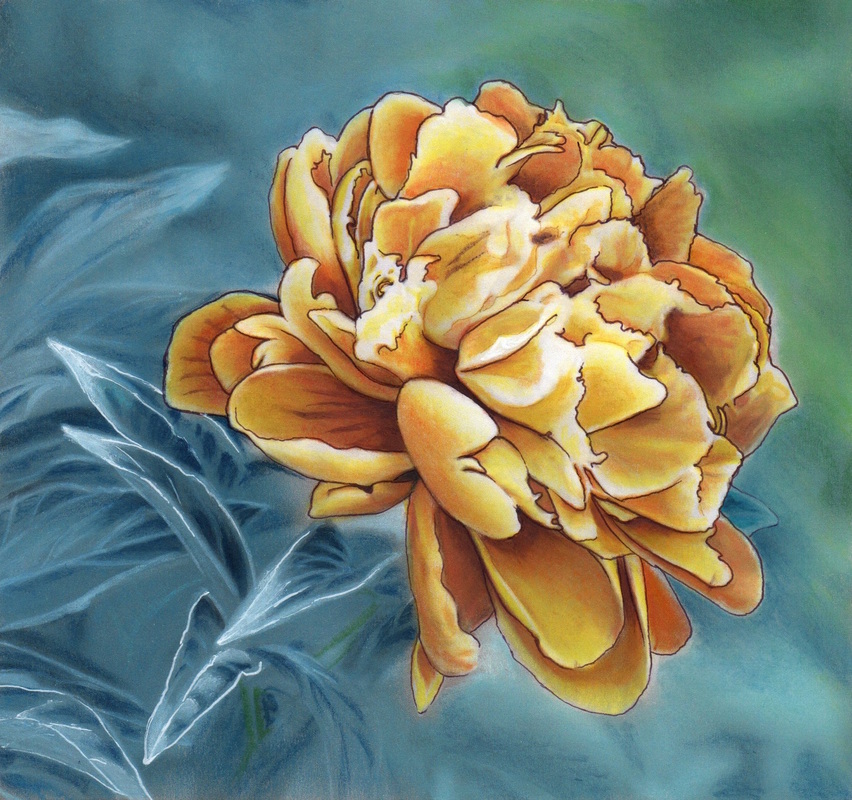
Colorist: Jones Flores
Coloring Book: Beautiful Nature Mediums Used: Prismacolor Premier, Soft Pastels blended with Hair Coat Oil by fingertips and by paintbrush, Faber Castell Fibre Tip Coloring Pens and Dong-A Ink Pens blended by paintbrush. Uni-Ball Signo White Ink Pen Tip 5: Outlining with Ink or Gel Pens for a Finished Look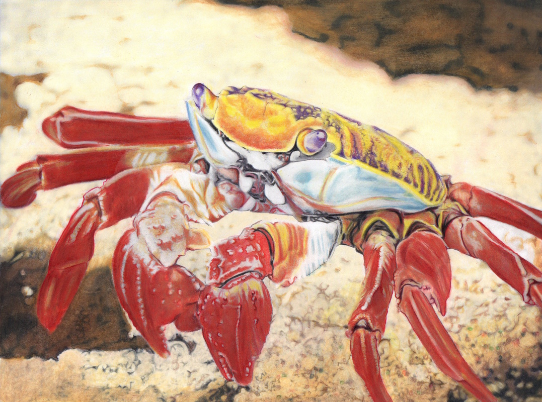
Colorist: Jones Flores
Coloring Book: Beautiful Creatures Mediums Used: Prismacolor Premier with Berkeley Turpentine applied with brush and Dong-A Gel Pen
That final touch can take a colored picture from good to great. A very thin line outlining parts of your subject can give it that finishing touch and make your image really pop! A good way to do this is with an ink pen with a very small point in order to achieve that very fine outline and create the sense of a 3D image. If you use too thick of a line then it will look overdone and not have the same effect. No need to outline the entire subject. Just the parts you want to emphasize or where the camera is focused on.
In the case of the crab above, an ink pen with a very small point was used to create a very fine outline on the pinchers, legs and eyes. A Violet ink pen was used to outline the eyes and Red was used for the pinchers and legs. Tip 6: Soft Pastels and Pointillism for Texture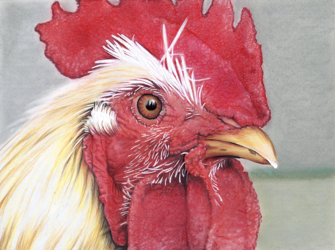
Colorist: Jones Flores
Coloring Book: Beautiful Creatures Mediums Used: Prismacolor Premier, Dong-A Ink Pens, White Pigment Pen and Soft Pastel mixed with Hair Coat Oil (aka argan oil, it's thicker than baby oil)
To enhance and emphasize the texture of this picture soft pastels and pointillism (small distinct dots) were used. First, the the rooster's comb and wattle (the reddish parts on the head and under the beak) were colored with red soft pastels. Then small dots were applied with white soft pastel. Some dots were smudged to enhance the texture. Then, Prismacolor Premiers were used to deepen and enhance color where needed as well as to further define specific details (e.g. the folds).
SOFT PASTEL TIP FOR BACKGROUNDS: The background was done with soft pastels and baby oil for blending. Apply the pastels generously and push the pastels into the paper with your finger. Then, add baby oil with your fingertips to smooth out and blend the pastels. TIP 7: Cloud Coloring Technique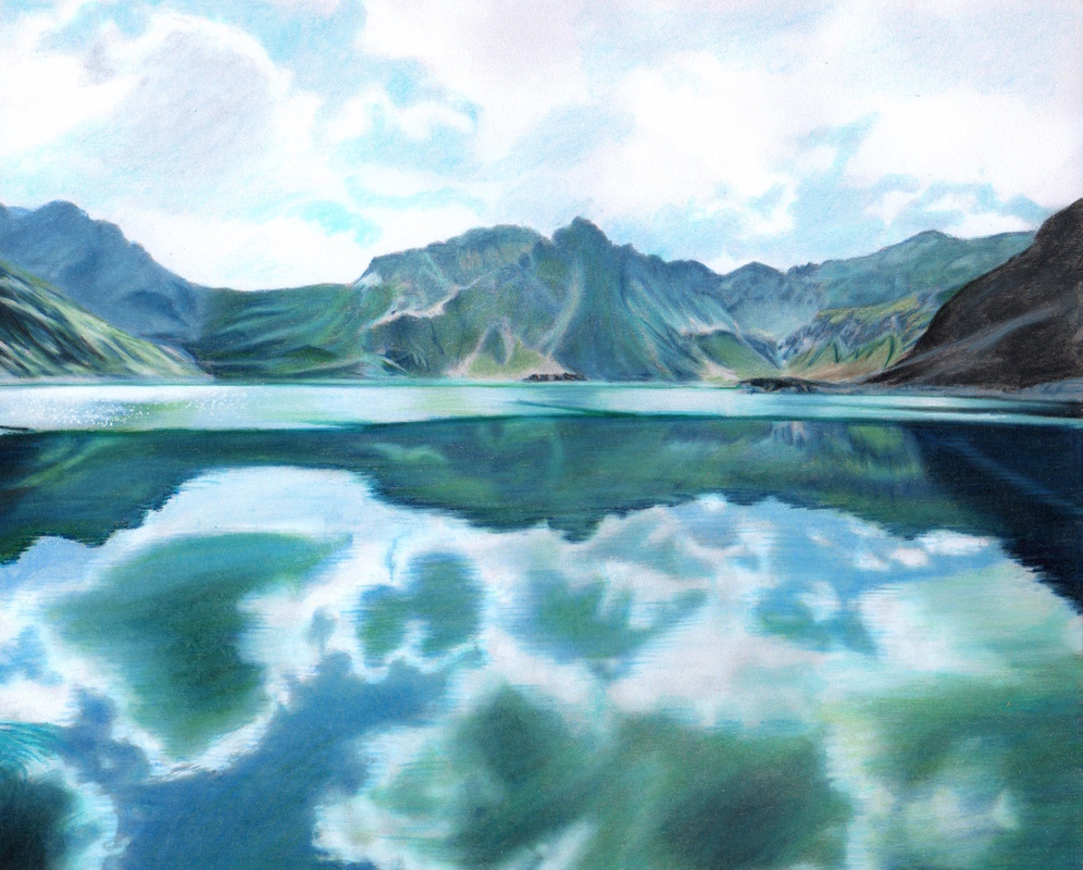
Colorist: Jones Flores
Coloring Book: Beautiful Nature Mediums Used: Primacolor Premier colored pencils mixed with Berkeley Turpentine, Dong-A ink pens and White Pigment Pen
When coloring clouds the key is to add more colors than just white. There are shadows in clouds so white clouds aren't just white. The grayscale (original) version of the image above showed this shading so you just need to follow it when determining where to use white and where to use a darker shade.
Clouds in the Sky For the clouds in the sky, White Prismacolor was applied lightly on the clouds as the base color, then a little Silver in the middle to give it shadow and weight, Then, a mix of Light Cerulean Blue and True Blue on the blue skies. The final touch was burnishing with White Prismacolor to enhance the overall brightness of the sky and clouds. Clouds in the Reflection With a reflection in water you need to consider the color of the water and the impact it has on the color of the clouds in the reflection. Therefore, you will still apply a similar approach as the clouds in the sky but you will incorporate some darker colors. Black, True Blue, Dark Green and Olive Green were used on the clouds' reflection to emphasize the depth of the water and brightness of the clouds. Ink pens were used to detail the ripples to give the effect of reflection. Finally, white dots (pointillism) were added on the surface of the water to make it sparkle! Tip 8: Creating the Effect of a Water Background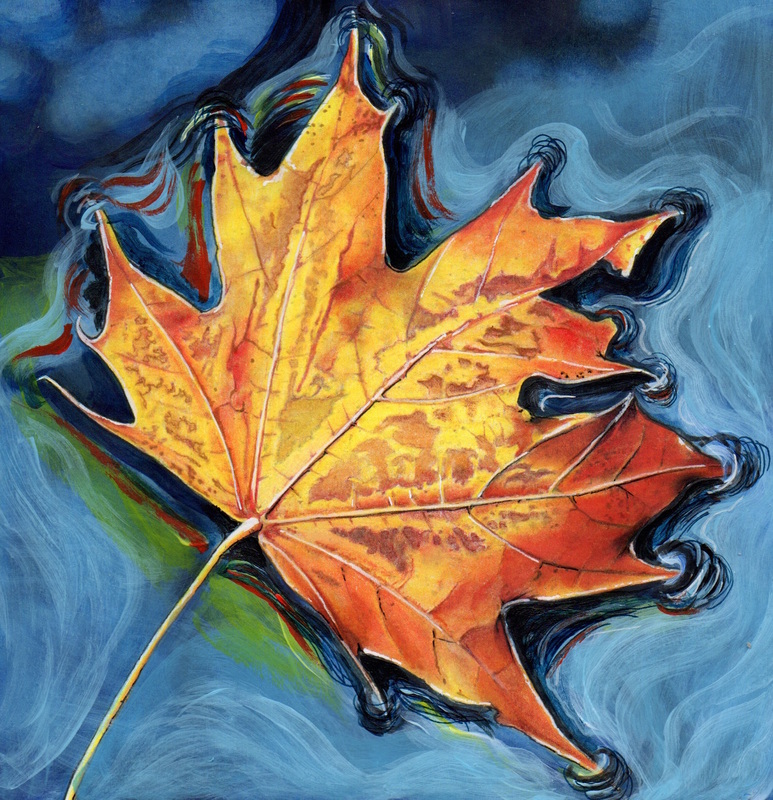
Colorist: Jones Flores
Coloring Book: Beautiful Nature Mediums Used: Prismacolor Premier colored pencils, Dong-A Ink Pens, Pilot G-Tech 0.3 (Black), White Rotring Isograph Pen and Acrylic Paint for the background
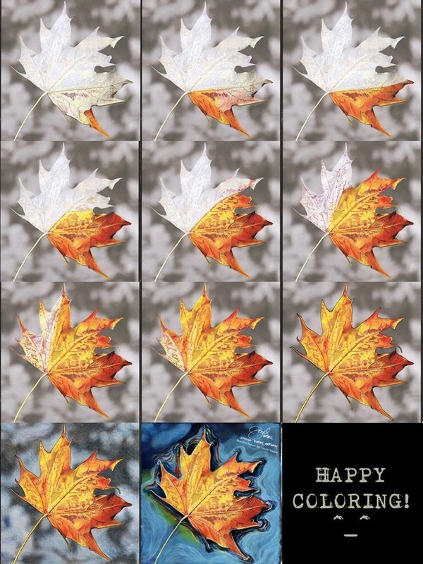
To make this leaf stand out the background was turned into a water background! Acrylic Paint was used to create the light blue reflection of the skies on water. Ultramarine paint was selected for the shadows of the leaf and to add the ripples. Then, ink pens and Prismacolor Premier pencils were used to add the swirls at the edges of the leaf to make the ripple effect.
The secret to achieving the feeling of the subject floating on water is the PATTERN! Follow the outline of the leaf to create the curves and that will become the pattern of the ripples. Here's a progression of the leaf being colored. You can see how the touches that were done to the background, in particular the ripple effect, really achieved that feeling of floating on water vs. the original background which was the leaf falling down to the ground. Tip 9: The "Erase with Tape" Trick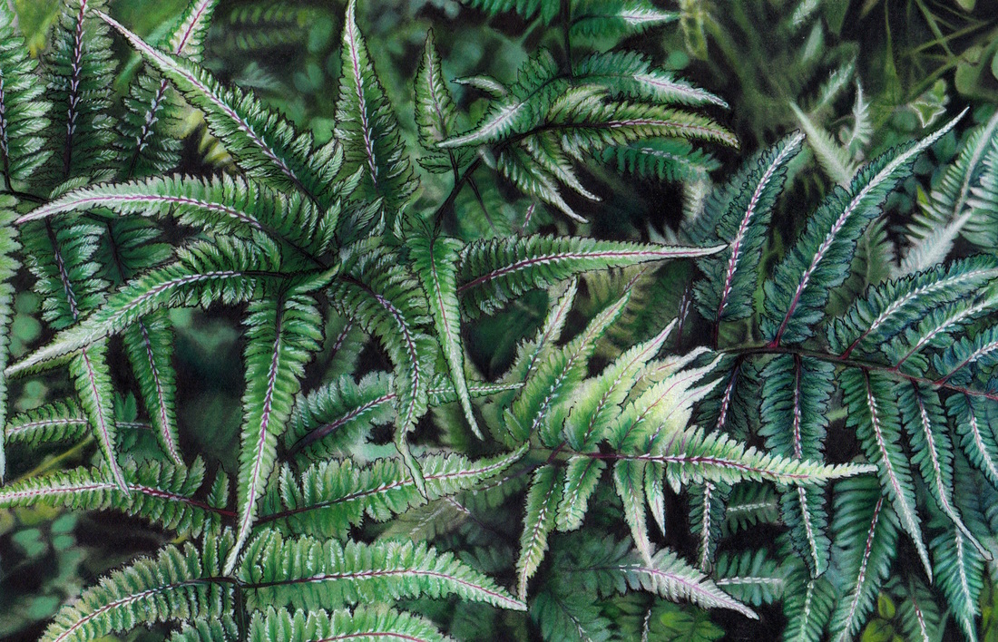
Colorist: Jones Flores
Coloring Book: Beautiful Nature Mediums Used: Prismacolor Premiere mixed with Berkeley Rectified Turpentine, Scotch Magic Tape, Ink and Gel Pens and Rotring Isograph Pen (White)
Many, many layers of colors were added to these ferns. Jones then realized she wanted to lift some of the color off after it had been added so she could make some changes. She tried erasing but that didn't do the trick. That's when she discovered a way to lighten up colored pencils while keeping the paper workable. The key is MAGIC TAPE! Yes, Scotch Magic Tape!
Here's how:
IMPORTANT NOTE: Before using this technique on your actual work be sure to test it on a separate paper so you can avoid any unwanted results. Tip 10: Getting a Smooth Background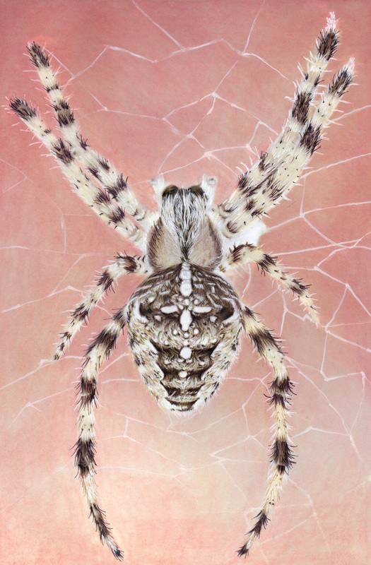
Colorist: Jones Flores
Coloring Book: Beautiful Creatures Mediums Used: Prismacolor Premier colored pencils, Dong-A Ink Pens, White Pigment Pen and Berkeley Turpentine blended by paintbrush
When coloring a large, not very detailed background with colored pencils you can be left with the scratchiness of the pencil strokes unless you use a blending pencil to try and smooth things out but that doesn't always do the trick. After applying several layers of colored pencil you can achieve a nice softness and smoothness by applying any of the following by paintbrush over your colored pencil layers: Gamsol, Baby Oil, Argan Oil or Turpentine. There are likely others too, let us know in the comments what you use!
To do this, just dab (don't soak) the paintbrush in the Gamsol, Baby Oil, Argan Oil or Turpentine and apply it on top of the colored pencil. Keep dabbing and brushing until all the tiny white spots are covered and the texture becomes smooth. It's important to remember that you must first apply several layers of colored pencil so that when you apply the blending agent it has enough colored pencil to blend! This technique was used by Jones for the background of the spider above. She used Berkeley Turpentine blended with a paintbrush.
I hope you found these tips helpful! If you have any comments or questions please be sure to leave them below.
Happy Coloring!
Raylee Glasby
10/11/2016 01:46:06 pm
Thanks so much for your tips. I have yet to try them but will have fund experimenting. Thank again.
Gemma Calimeri
10/11/2016 03:05:03 pm
Great tips! Thanks for sharing.
cheryl
10/11/2016 09:29:00 pm
I found this extremely helpful! I thank you very much for this. i have enjoyed coloring grayscale and have more books coming, including "beautiful creatures" coming in this thursday. i was already worried it would be too hard for me, but these tips sure help. i especially am grateful you explained "burnishing".. all the videos i have watched said to do this but didnt explain what it was.. so many thanks for these tip!
María Flores-Collazo
10/13/2016 06:33:19 am
Thanks for sharing!
Gloria Hammontree
10/14/2016 09:50:28 am
amazing, I love these techniques. Thank you so much.
Valerie
10/15/2016 01:13:03 am
Thank you for sharing the techniques and tips. I appreciate it a lot. I'm going to definitely try to do everything you suggested. I wish you would do videos on each one of the pictures, so we can see what your talking about a lot better. Can't wait for more tips from you. Keep them coming. Thank you.......
Carolyn Allison
10/19/2016 10:26:59 am
Thank you for these tips. Until yesterday I colored alone. I have 3 grayscale coloring books and no clue where to start. I realized I wasn't in Kansas any more after I ruined the picture in under a minute. Again thank you very much!!!
Rosemary
10/21/2016 01:28:36 pm
Do you have a hard copy book with all this great information? 10/22/2016 07:28:16 am
Not yet but I'm thinking about putting it all together as an e-book download for my blog readers/subscribers. If/when I do that I'll be sure to notify everyone on my email list so make sure to sign up for the Grayscale Coloring Tips newsletter. You can find a sign up box at the very bottom of the page or the top right just below the blue tiger :). Thanks so much for your interest in all the information! 10/27/2016 07:25:19 am
When you do make an e-book please make it available for Nook also. Thanks for everything you do.
Anita Olson
11/20/2016 04:26:43 am
Enjoyed your tips so much and found them very helpful as I am just beginning to use colored pencils. I have done many oil paintings but do not have the space to do much painting any longer. I love the grayscale pictures in your books and the way in which you use the techniques you are sharing to have them look like they have been painted by blending the colors, outlining and highlighting. areas. I am looking forward to your e-book of techniques. 5/22/2017 09:14:45 pm
I'm brand new to this hobby but very excited about it, now that I realize that it's much more than "comic book" coloring with markers & gel pens. I've bought a variety of types of colored pencils and water color pencils; sites like yours will definitely teach & guide me so that I can really get involved in this activity and succeed with it. Thank you to everyone who provided hints and tips in this section!! I can't wait wait to get started and hopefully post and share some pretty pictures with you soon. Thanks again!
Rhonda Hutchins
10/13/2017 08:20:19 am
Thank you for the tips. I needed refreshing on some and learned some new ones. I look forward to your book of tips and any videos you post. Comments are closed.
|

