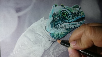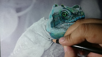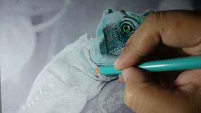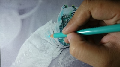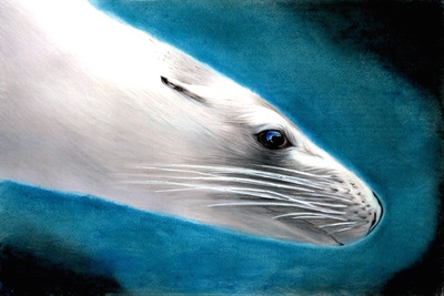
Colorist: Jones Flores
Coloring Book: Beautiful Creatures
There are so many amazing colorists with all kinds of incredible coloring ideas and techniques to share. I thought it would be fun and helpful to start an "Advice From a Colorist" series of blog posts where I find a colorist that impresses us with their incredible talent and ask them to share some of their most unique coloring techniques. These are techniques that work wonderfully for grayscale coloring but can be applied to any kind of coloring.
Lucky for us, the very talented colorist Jones Flores is going to share some of her coloring techniques with us! Jones is a self-taught artist who believes art is an unspoken language that touches not only the mind but the heart as well. Specifically, you will learn:
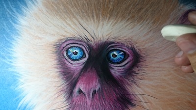
Let's get started... Technique 1: How to use an eraser to achieve softness.
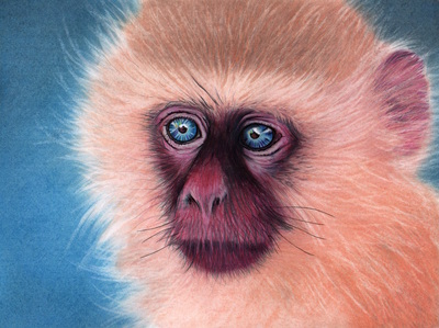
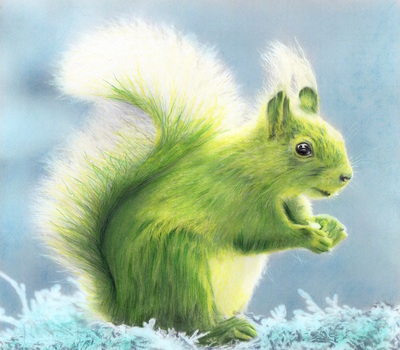
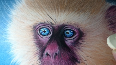
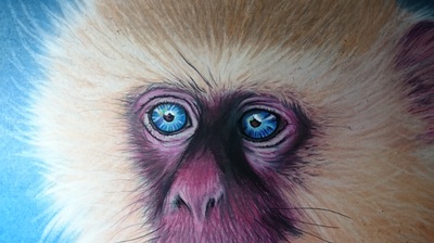
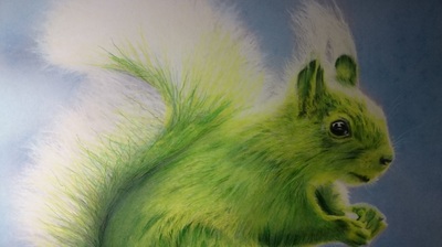
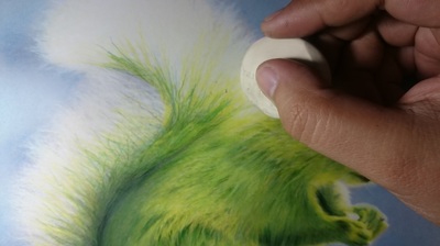
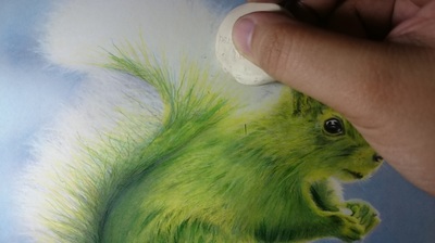
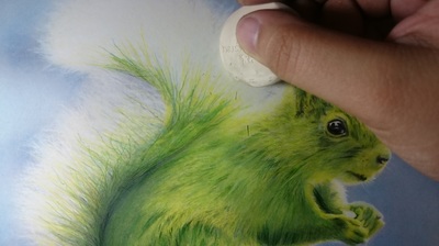
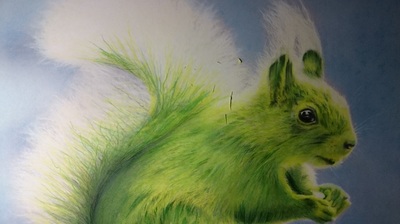
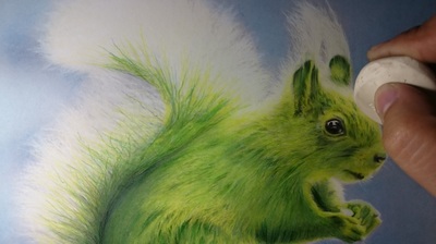
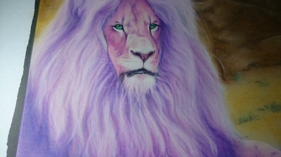
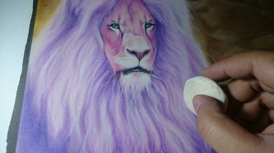
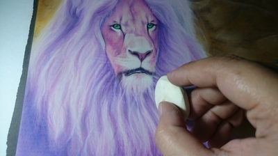
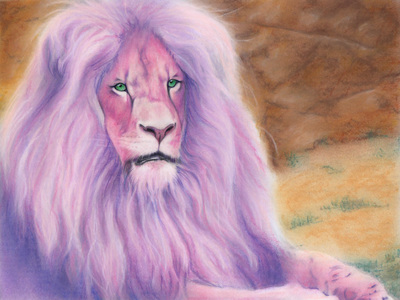
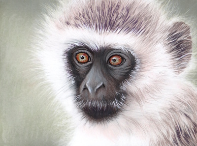
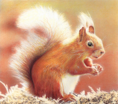
Note the beautiful softness of the hair for the lion, squirrel and monkey. Jones achieves this technique by using the lighter shade of the grayscale as the guide on erasing a layer of color over it. It then becomes the highlight on the hair giving it a nice flow. The key to achieve this is adding layers of color on the paper and then softly erasing the areas where you find the lightest grayscale.
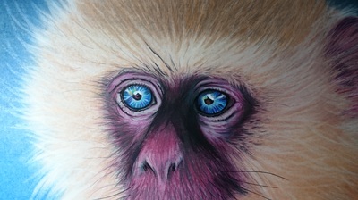
Here are some step-by-step photos so you can see where Jones is erasing in order to achieve the softness. Note that it's fairly subtle. In fact, you need to look closely to see where there was some color to begin with and how much actually got erased.
The monkey
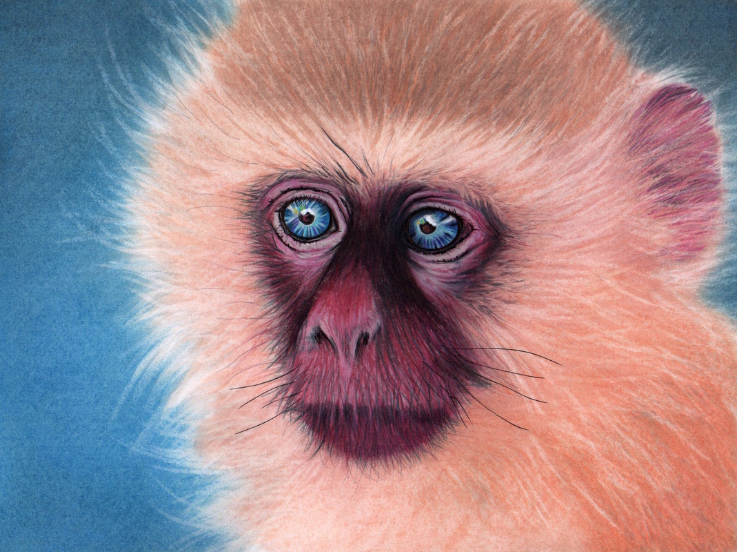
Colorist: Jones Flores
Coloring Book: Beautiful Creatures
The squirrel

Colorist: Jones Flores
Coloring Book: Beautiful Creatures
The lion

Colorist: Jones Flores
Coloring Book: Beautiful Creatures Technique 2: How to use soft pastels mixed with oil.
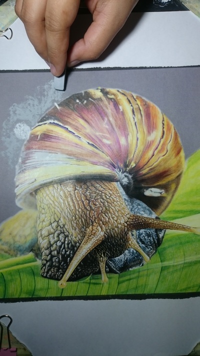
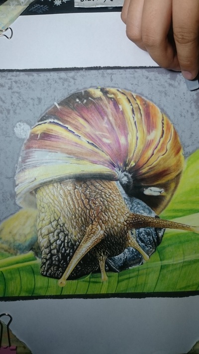
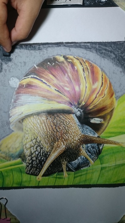
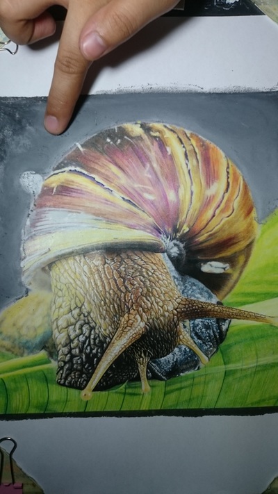
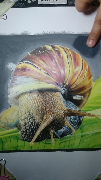
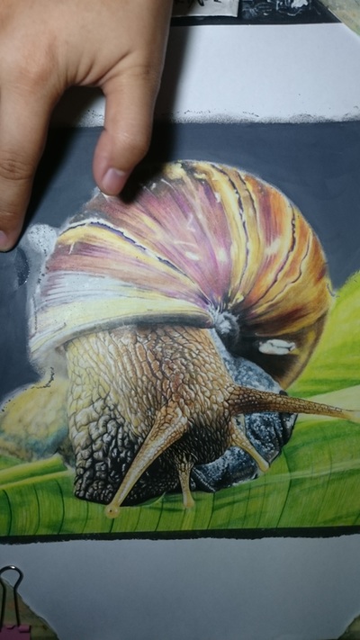
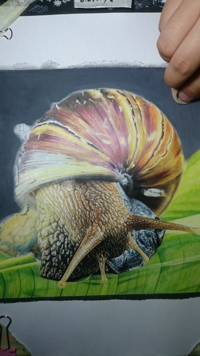
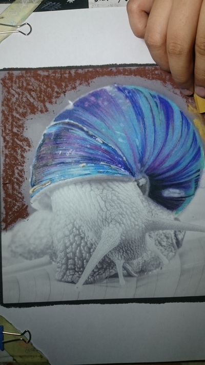
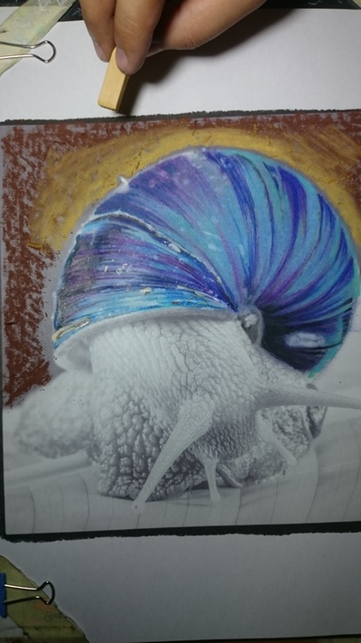
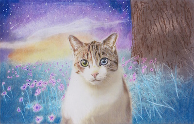
Jones usually uses soft pastels for the background of her colored pictures.
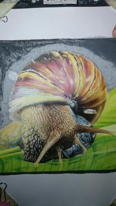
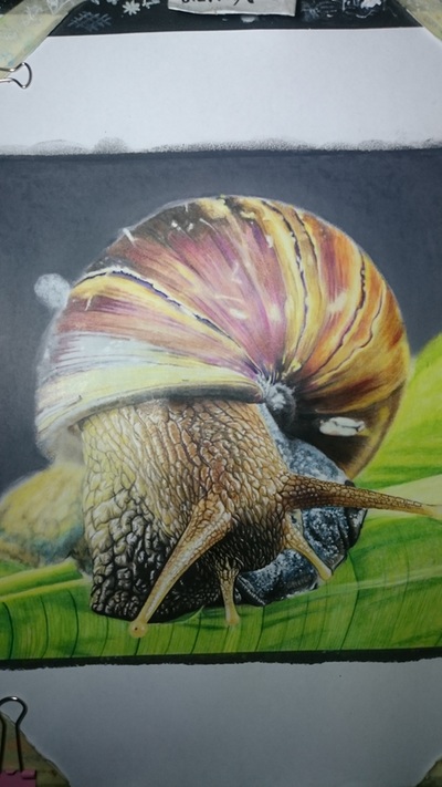
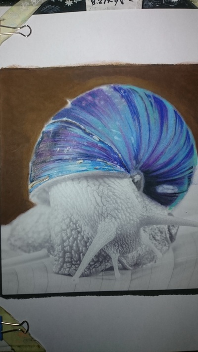
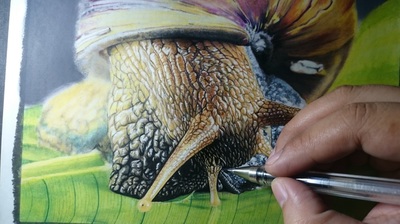
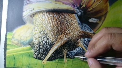
STEP ONE: she applies a base color whether or not she has chosen a light or darker color on the background. For example, on the snail she thought it should be a black background but to give it a nice tone she applied gray first by scribbling and evenly distributing the pastel widely on the paper then next is the color black. TIP: Once you apply a base color before a black (or any other color) pastel it will be easier to smudge the second pastel color on the paper with your finger and it will be effortless to apply. Jones planned on giving the snail a glow so the gray color was going to help adjust it to a vignette effect.
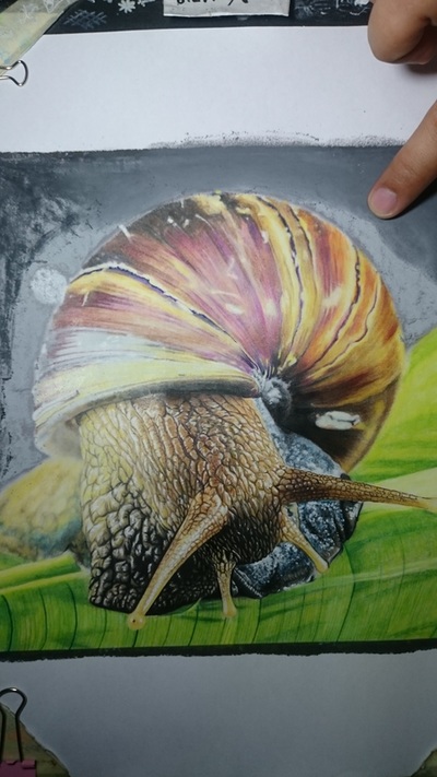
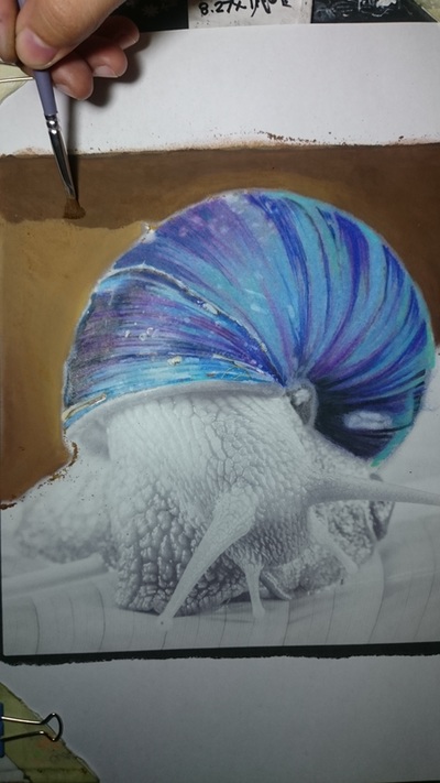
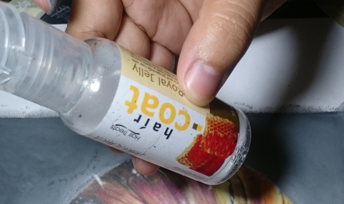
STEP TWO: Once she was satisfied with the mix, she applied the oil. In this case, she used hair coat oil (more about that in technique #5). She used her fingertips as the blending tool by smudging the oil over the pastels pushing it into the paper. Then she wiped away the excess pastels and oil by using tissue or a piece of cloth.
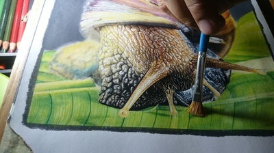
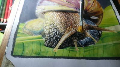
Jones also likes to use a paintbrush to blend oil and pastel however it requires more oil. Here is the progression from start to finish but with a paintbrush.
Technique 3: How to achieve vibrant color.
According to Jones, like painting, there should be a base color. This will help with building up the intensity and vibrancy of the color as well as with working towards achieving the final color you are striving for.
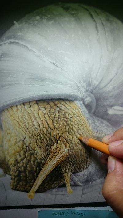
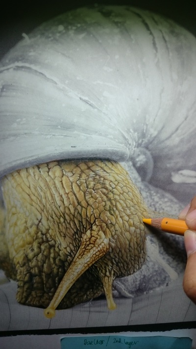
For example, in the snail images below she started by lightly applying Prismacolor Premier’s yellow or cream colored pencil on the bright grayscale areas then gradually applied a darker shade until the realistic color was achieved.
When it came to coloring the snail's shell, the trick she used was to apply orange, pink, violet, yellow and blue on the shell to achieve the realistic color. She didn’t limit herself to the most literal colors for the shell. Jones has been experimenting with adding different colors and finds they really enhance the overall color vibrancy.
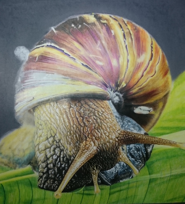
Colorist: Jones Flores
Coloring Book: Beautiful Creatures. Technique 4: How to use pointillism to enhance detail.
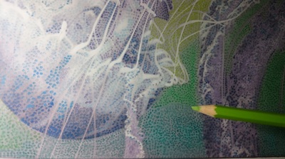
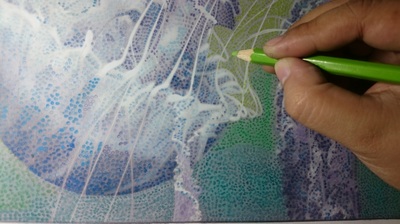
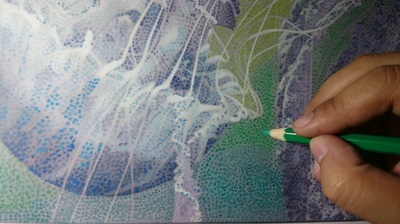
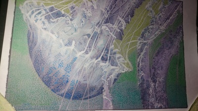
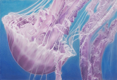
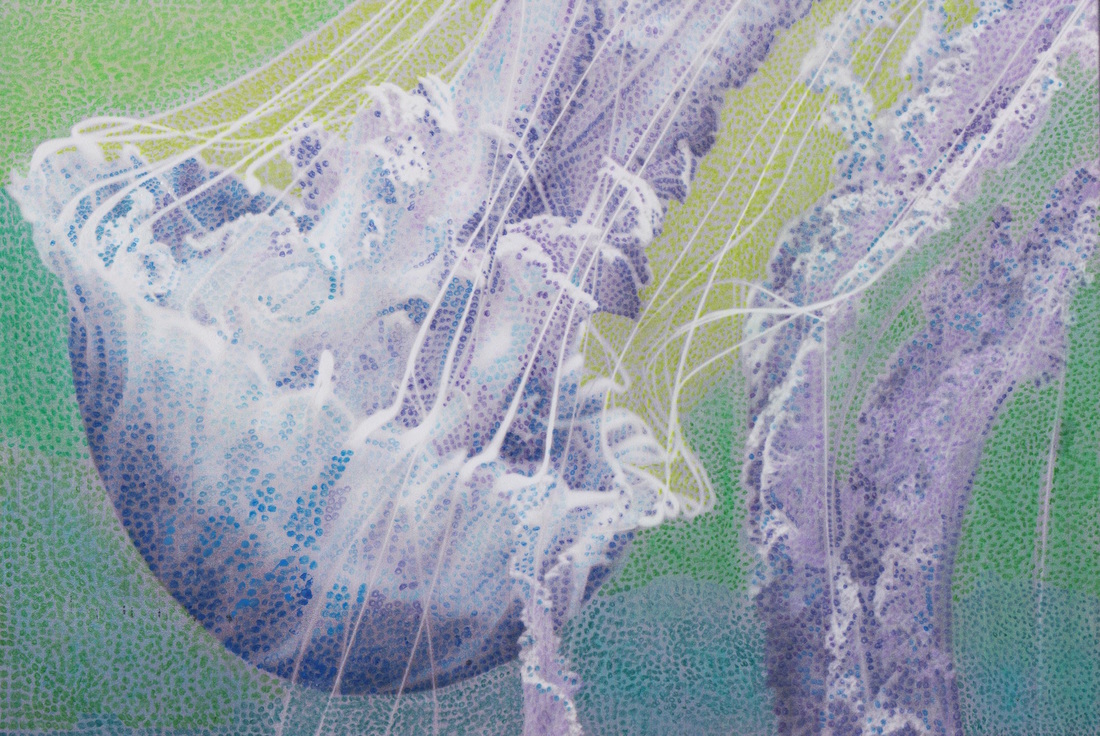
Pointillism is a technique that Jones finds very interesting. She just follows the grayscale as a pattern and it gives way to her imagination to choose what color to use (while still matching light colors to light grays and dark colors to dark grays), such as with this jellyfish. As you can see she does little dots of color in a given area instead of fully covering with color.
Once the entire picture is covered with the colored dots you can step back and see how it all comes together!
Colorist: Jones Flores
Coloring Book: Beautiful Creatures
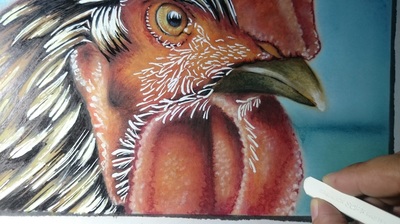
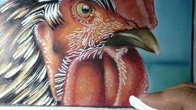
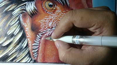
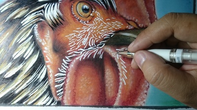
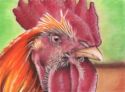
In the case of the rooster, she used pointillism to emphasize the texture of the wattle and comb. It has tiny bumps and pointillism gives details to those tiny bumps giving it a very interesting effect.
According to Jones, it is surprisingly easy to do. It's just like creating a dot but it does require patience. However, once the points come together, it is a very rewarding feeling to see a finished image. 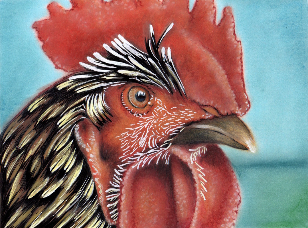
Colorist: Jones Flores
Coloring Book: Beautiful Creatures Technique 5: How to use Hair Coat Oil & Berkeley Rectified Turpentine for blending.
Jones taught me about two new and interesting materials for smoothing out and blending colors:
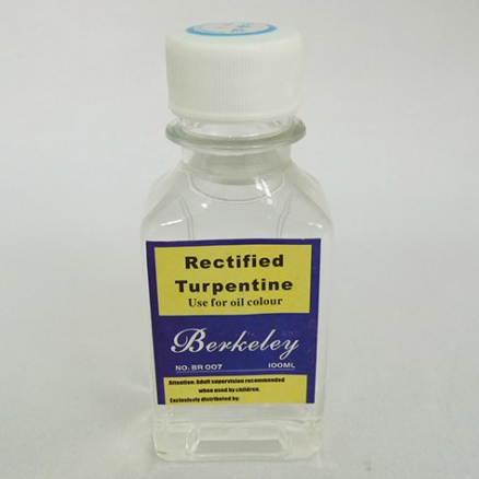
Berkeley Rectified Turpentine is a great medium to evenly distribute the colors and pushes the color to the paper covering all the small tiny white spots where colored pencils sometimes are unable to reach when applied gently. Jones uses the Berkeley Rectified Turpentine to spread the color into the tooth of the paper. She applies it with a paintbrush.
After applying layer upon layer of Prismacolor Premier colored pencils, Jones applies the turpentine. The turpentine brings up the colors and gives the layer of colors a smooth blend.
TIP: it dries fast so blending should be in less than a minute. Once turpentine is applied it is quite difficult to add another layer of colors. At least this is the case with wax-based pencils such as Prismacolor Premiers because the wax of the pencil resists the turpentine.
Hair Coat Oil is thicker than baby oil and not easily absorbed by paper. Jones finds it easier to blend pastels with hair coat oil and it even works well on top of layers of Prismacolor Premier colored pencils. It gives the coloring a painting effect. Hair Coat Oil dries faster than baby oil but it allows the additional colors to be mixed smoothly and it enables the paper to get more layers of colors.
TIP: You can avoid bleeding of oil on the back of the paper by applying only a small portion of oil like a small bead on your fingertip then onto the pastels in a circular motion. Technique 6: Key steps to follow when coloring a grayscale image.
Here are the steps Jones follows when coloring a grayscale image. This is the approach she has developed after coloring many grayscale images. Remember, there is no right or wrong way and this is just one approach to consider. Jones does her darkest areas first yet I know of lots of people that do their lightest areas first. It's important that you develop an approach that works well for you.
Step 1: Dark Outline
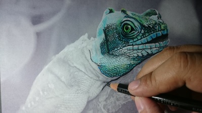
Jones lightly applies a black colored pencil as the outline to the very darkest areas.
Step 2: Apply Base Colors and Layer
Next, she applies base colors, matching the light or darkness of the base color to the level of gray she is coloring over. These base colors will usually be the lighter shade of the final color you will apply. Add your base colors and then build up the color with layers until you achieve the color you are working towards. For Jones, these colors cover everything between black and white.
Step 3: Enhance the Lightest Shades with White Ink Pen
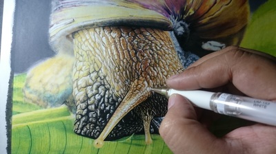
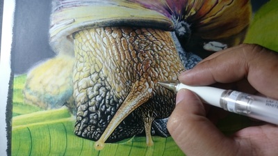
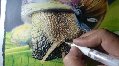
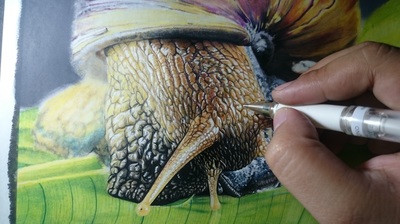
For the very lightest areas of the grayscale (where it is white or almost white), add layers of white ink pen that get you closer to the target realistic shade. To do this Jones uses the white ink pen to create an effect of the reflection of light and moisture. Also, for the lighter parts, she uses white ink pen when lightening up some mid-tones by smudging it over the area she wants to adjust. TIP: Usually it is difficult to lighten the color after applying any dark colors; however, on very small areas white pigment inks can be very helpful.
Step 4: Detailing
Emphasize the darkest tones and the lightest tones. Jones usually uses gel or ink pens to do the detailing, She applies black thin lines on the edges of the outline that she created in the first step. This makes a 3D-like effect. Then, white pigment marker on the lightest grayscale gives it the effect of light, shadow and moisture (like on the snail).
A reference photo helps when doing realism style. Jones says that doing her own version is lots of fun and exercises her imagination, liberating her mind to choose any color instead of depending on a reference photo. The grayscale guides her all the way to the satisfying finished work of art!
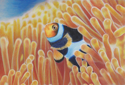
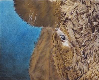
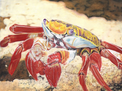
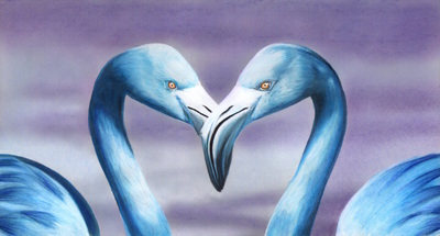
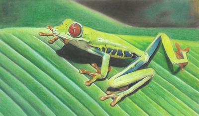
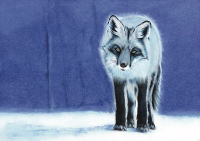
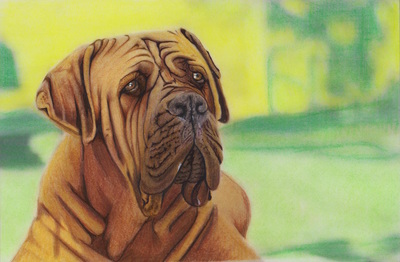
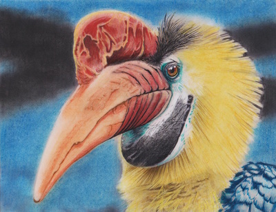
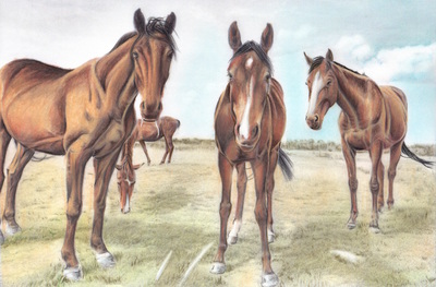
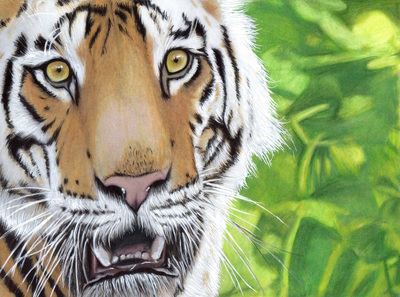
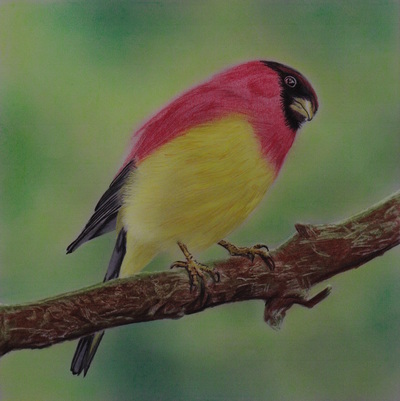
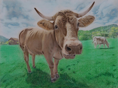
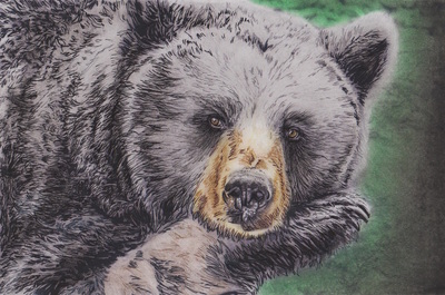
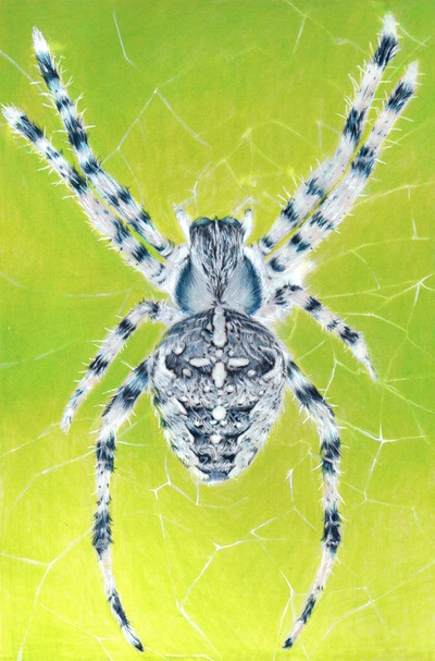
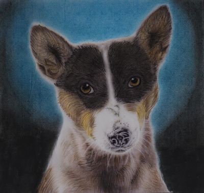
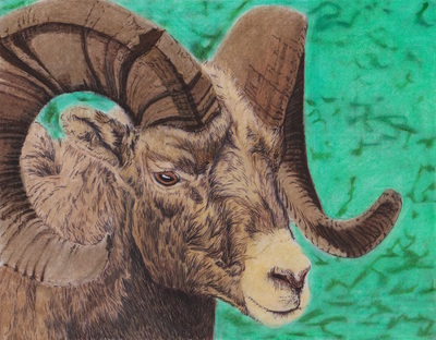
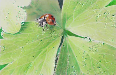
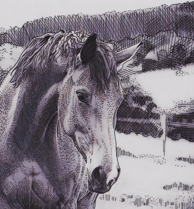
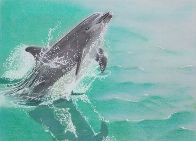
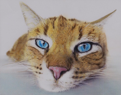
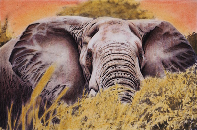
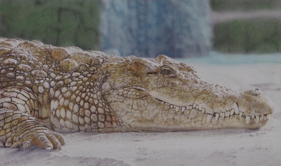
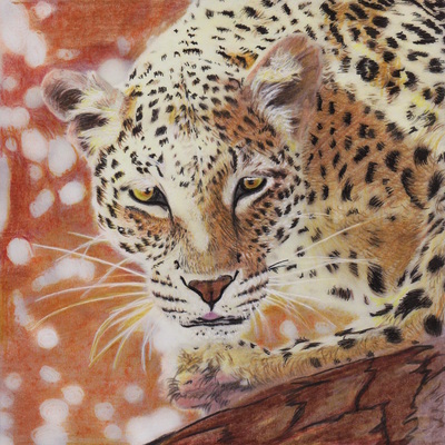
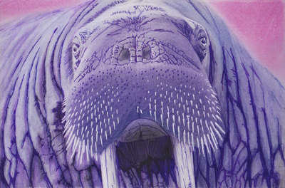
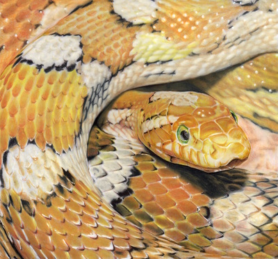
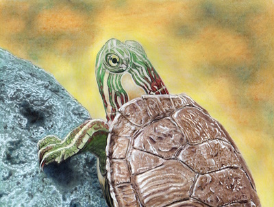
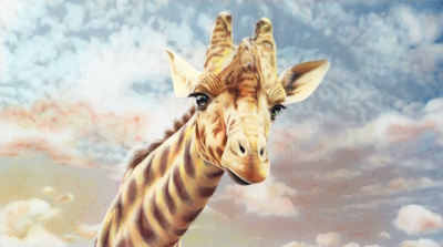
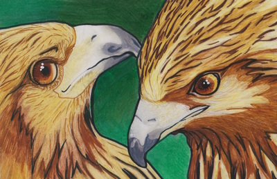
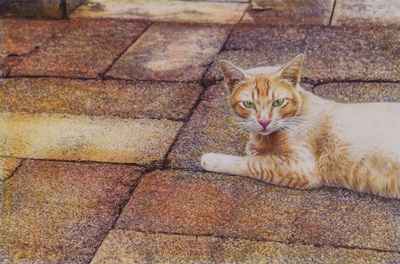
On that note, check out some of the fabulous pieces completed by Jones from the Beautiful Creatures grayscale coloring book:
I hope you found these techniques as interesting and useful as I did. If you have any questions for Jones be sure to leave a comment here for her or on her Facebook page.
If there are any other colorists out there with some unique coloring techniques that they would like to share in an upcoming "Advice From a Colorist" blog post, then please leave a comment or contact me. Happy Coloring!
Linda Tschappat
4/28/2016 03:06:58 pm
Wow, great article. Going to have to re-read it from my computer so I can save the info. Super awesome breakdown of the techniques, hopefully I can manage to get some of it through my thick skull! Thanks so much, excited to continue reading. This is going to be a bomb-diggity blog!
Vani Kurup
4/28/2016 08:51:38 pm
Wow! Thank you Jones for sharing these incredible tips. Cannot wait to try these. I am saving this article as I would need to really read them while I am working on an image.:D...
Jennifer Creek
4/30/2016 09:24:47 am
This was a great blog post! I cant wait to read more.
Jacqueline
9/18/2016 07:55:22 pm
Thank you very much, very helpful tips.
Dawn
10/10/2016 03:45:09 pm
Thank you so much. I am trying so hard to do grey scale. This is helping. Comments are closed.
|

