|
Each time I color I attempt to do something new or different in terms of either the medium I use or the colors I choose. The two examples below are about my color choices. I attempted to incorporate colors that I wouldn't normally have used either in relation to the subject or in combination with the other colors used for the picture. I learned that getting creative with color can create some wonderful results.
I was inspired to do this by Christine Kowbuz (read an interview with her here) who uses color to set off other colors so beautifully! I still have lots to learn but I hope to keep experimenting and to learn more about color so I can achieve better and more exciting results! TIP 1: Increasing Impact & Depth With Color
Colorist: Nicole Stocker
Coloring Book: Beautiful Creatures
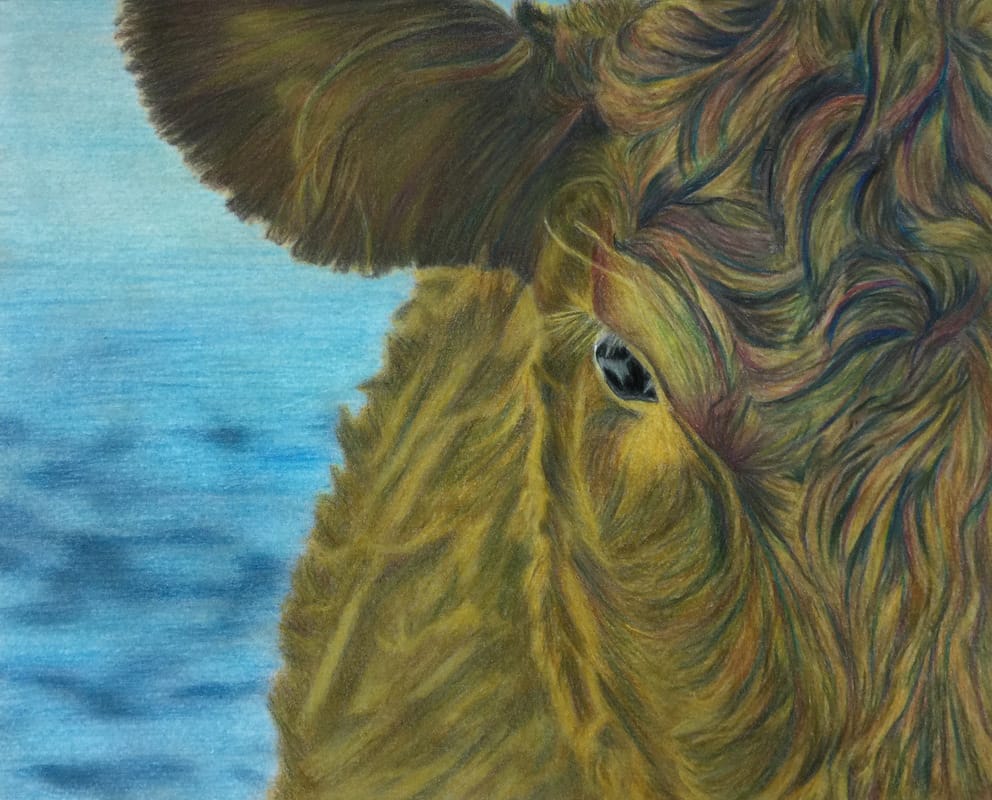
I colored the cow using a predictable palette of browns with some yellow and black. I found it was a bit flat so then I decided to try to create more depth & impact by using some reds and blues as accent colors. I made sure to still "follow the gray" when deciding where to use the reds and blues. This means I colored over the medium to dark gray areas with the reds and blues and not the light gray areas because that would have taken away from the highlighted areas which contrast with the shaded areas to help create the shape & depth.
By accenting with these bolder/contrasting colors the shaded areas are became more intense and interesting (i.e. more shape & texture) while also creating what I believe to be more of a 3-D effect (or perhaps I'm just hoping for that?!). To me, the head feels even more like it's coming forward vs. the cow's body that is a bit softer and fading away slightly. I'm very curious to try this with other pictures. I believe if I had just used a larger range of browns then I would have gotten quite a realistic result but it wouldn't have been as strong. What do you think? Tip 2: A Limited Palette That Gives You All You Need
Colorist: Nicole Stocker
Coloring Book: Beautiful Nature
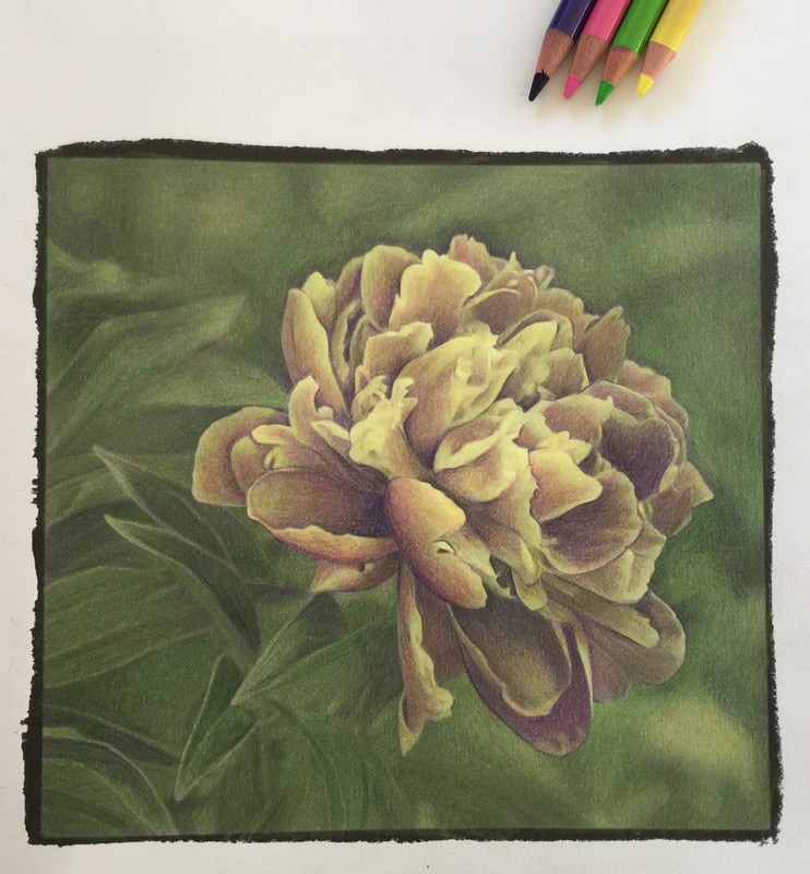
I love working with a limited palette. There is something so simple and relaxing about it (as if coloring isn't already relaxing enough!). However, if I limit my palette when coloring grayscale then I have usually limited it to a somewhat monochromatic palette with a range of lights to darks rather than a range of truly different colors. This time I challenged myself to work with just four different colors for the entire picture, including the background: yellow, green, pink & purple. For this picture I used three colors on the flower petals and three colors on the leaves and background:
Flower petals: yellow, pink & purple Leaves & background: yellow, green & purple Here are the steps I followed:
Overall, I was very pleased with the results. I love the beautiful, delicate colors that resulted from layering as well as the wonderful yet not too stark contrast between the flower petals and the leaves and background. Because there were common colors throughout the picture there is a nice continuity but that small difference in the palette for the flower petals vs. the background and leaves provides the perfect amount of contrast. I really enjoyed coloring this way. I look forward to trying it again and getting more creative with my colors. If you haven't already tried experimenting with color I encourage you to. It was really fun! I didn't know what I was doing but that was part of the fun and made it that much more exciting when I achieved a result I was happy (and surprised!) with! If anyone has any tips about using and selecting colors I would LOVE to hear them! Please leave a comment below. Happy Coloring!
Dianne Allen
1/12/2017 01:35:20 pm
It would really enhance what you are communicating to us doing a video of same. I learn from watching someone do something much more than I do reading about how to do it. Thanks 1/12/2017 04:12:35 pm
Thank you for the feedback! I'll try to do more video in the future. In the meantime, here is a link to a bunch of the grayscale coloring videos that have been featured on this blog: http://www.huelish.com/grayscale-coloring-techniques/category/grayscale-coloring-video-tutorials
Christine M Camp
1/12/2017 01:50:20 pm
Great job on the head of the cow. It really gave it a much more realistic appearance. I wonder what it would have looked like if you had done the whole cow that way? 1/12/2017 04:17:32 pm
Thank you, Christine! I wonder too. I'm really not sure if it would make it more realistic and create even more shape and depth or if it would detract from the effect of the colors on the head. I might have to give that a try in a future coloring. Thanks for the suggestion!
Raylee Glasby
1/18/2017 03:19:00 pm
Thank you everyone for your tips. I am a learner and these tips are invaluable to me. Keep them coming. 2/27/2017 10:39:55 am
Is there anyway for you to put a actual link to the videos you talked about. Its not a actual link where I can just hit it and it will take me there. It's the top comment where the lady asked you to do a videos makes it easier to understand it. In your comments you put a link but it's not highlighted to take me to it. Sure appreciate it. Thsnk you so much for always giving us tips and tutorials. You are so talented and so kind. 2/27/2017 12:55:09 pm
Unfortunately links don't seem to show up as clickable here in the comments. You will need to copy and paste the link into your web browser bar. Here is the link again for your to copy and paste: http://www.huelish.com/grayscale-coloring-techniques/category/grayscale-coloring-video-tutorials
Teri
4/24/2017 12:32:26 pm
I LOVE your books! The tips here are excellent, but the real-time video tutorials are what finally made me pickup the pencils and start coloring. I stress incredibly about choosing colors, (OCD, I guess) and the pencil videos have fixed that. 4/24/2017 01:36:40 pm
Thank you for the wonderful feedback, Teri! I really appreciate it! I'm thrilled your first picture went so well. It really is incredibly satisfying to produce such a photo realistic result. That's what caused me to fall in love with grayscale coloring. Comments are closed.
|
